Once you log in, you will see the Main Dashboard. There you will find the Presentation View and the Desktop View. This is your command center for decision-making, designed to give you a panoramic view of risk management before diving into asset assessment.
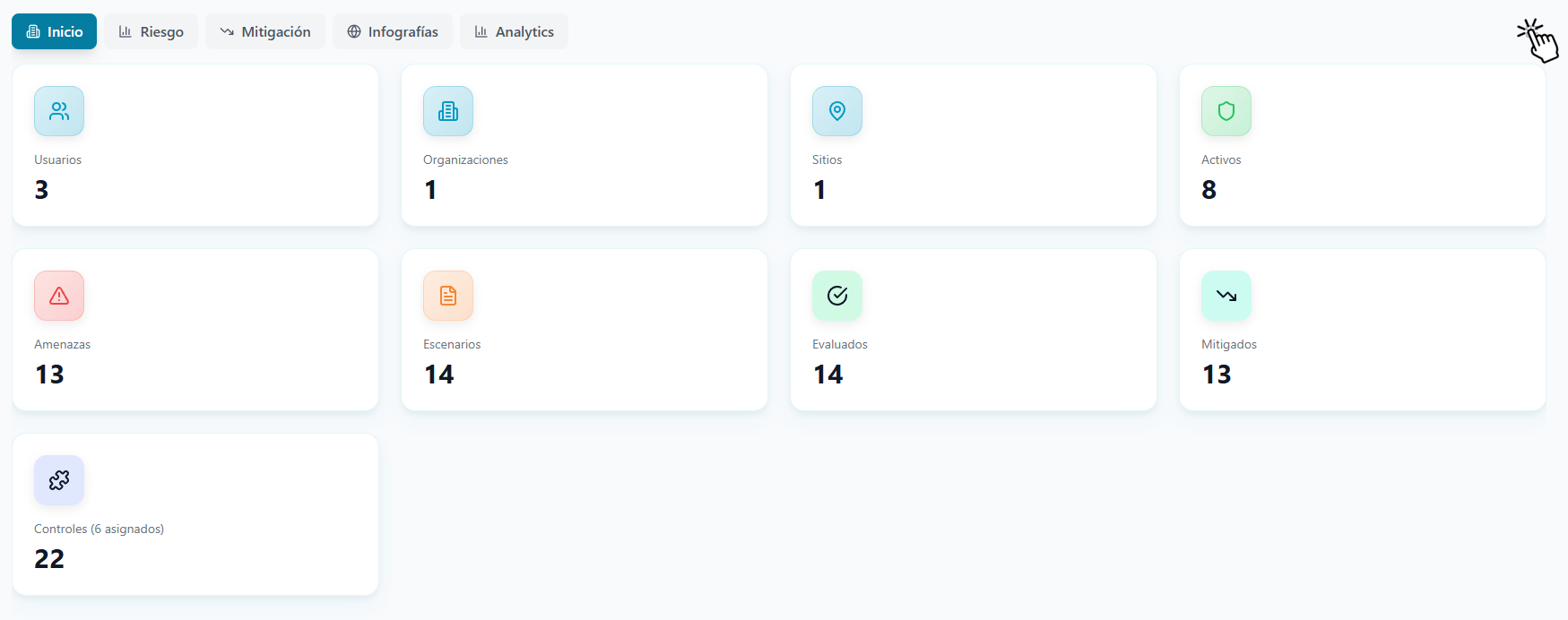
On the home screen you will find:
- Statistics Bar (Cards): A quick summary at the top showing the count of Users, Organizations (Orgs), Sites, Assets, Threats, Scenarios, Assessed risks, and Mitigated risks.
- Suite Modules: Direct access to the main tools, such as P-ERM (Risk Analysis), IM (Incident Management), and P-BCM (Business Continuity).
Display Modes: Desktop vs. Presentation
To adapt to the exact moment of your workflow, the Dashboard allows you to switch between two display modes. You can toggle between them by clicking the view icon (represented by a grid) located on the far right of the screen, at the height of the navigation tabs.
- Desktop Mode: Designed for configuration and agile operation. It displays wide, clean cards with your key indicators (Users, Organizations, Assets, etc.). It is the ideal view for quickly navigating to work modules and managing day-to-day information.
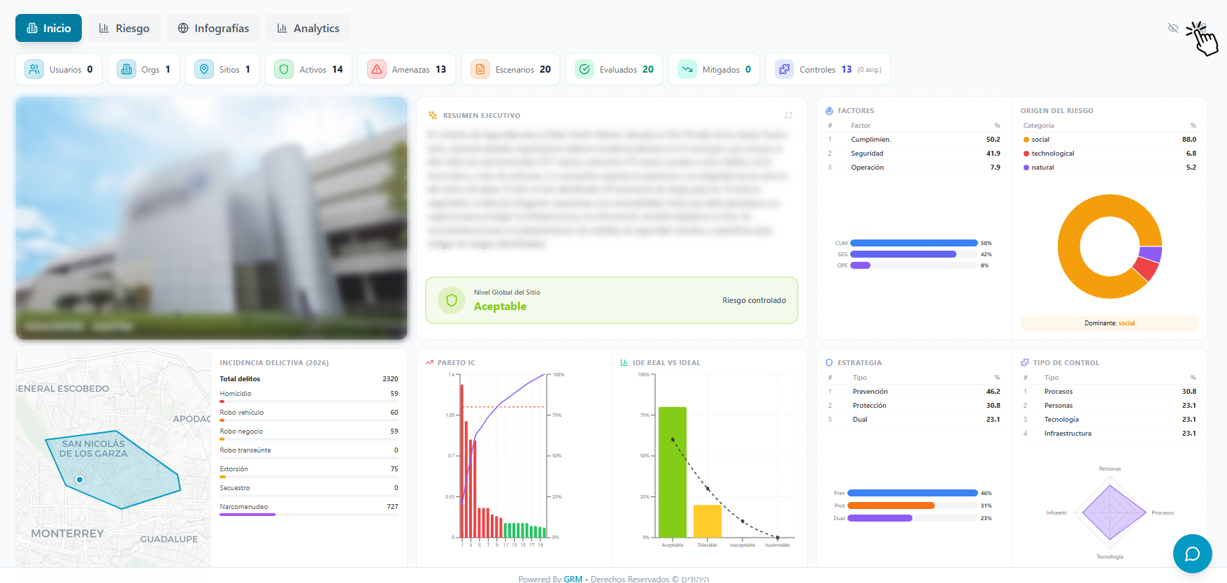
- Presentation Mode: A visualization tool for analysis and better visual understanding. When activated, the dashboard transforms into a comprehensive analytical panel displaying the site’s executive summary, Pareto charts, radar charts, and crime incidence statistics. It provides all strategic intelligence on a single screen, ready to be projected and discussed with senior management.
Detailed Analysis (Maximize Cards)
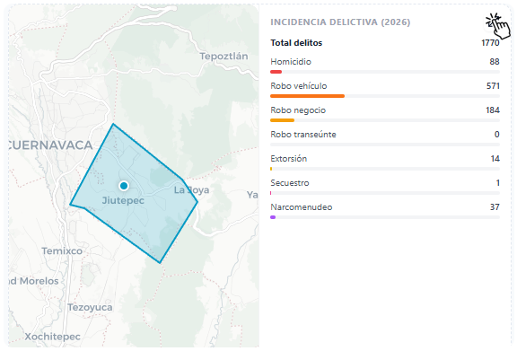
To facilitate the review of complex data during your presentations, the presentation mode allows you to expand key modules. If you see an expand icon (two diagonal arrows) in the upper right corner of an analytical card (such as the Crime Incidence viewer), click on it. The platform will maximize that information in a central pop-up window, providing an enlarged and focused view of maps and statistics for a more comfortable analysis with your team.